Layouts
Layouts are the building blocks of your slides. They define the structure of your slides and how the content is displayed. This theme comes with a set of predefined layouts that you can use to create your slides. Many of these build upon the default layouts provided by Slidev, adding additional parameters to customize the structure of the slide. The goal is to save you time and effort designing custom layouts in CSS/HTML.
Key components of layouts
Layouts have two key components: frontmatter (which is YAML metadata at the top of the slide) and the content of the slide which are known as slots.
Frontmatter
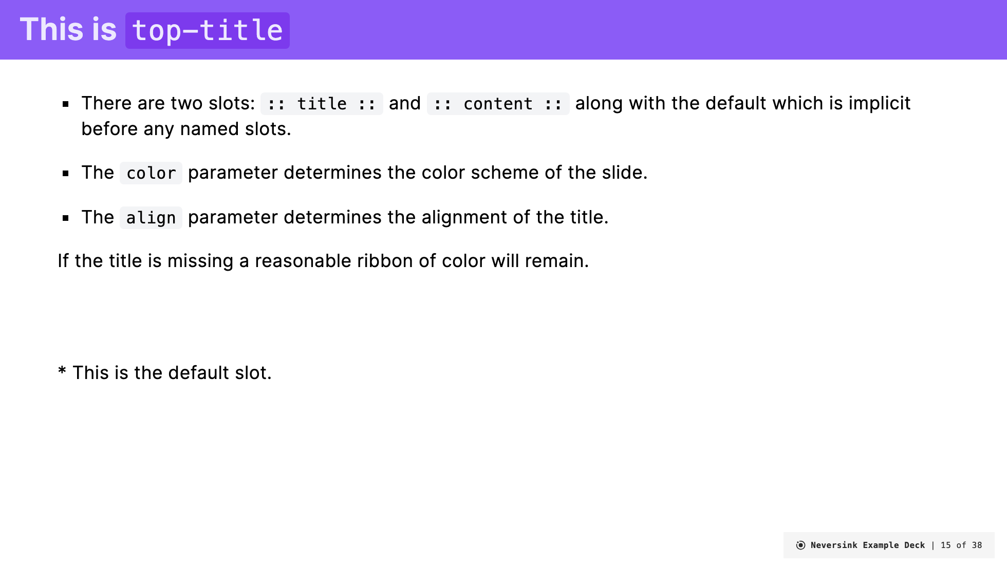
The frontmatter is used to specify the type of the slide as well as provide parameters to the layout (see Slidev docs). The frontmatter is a YAML block at the top of the slide that specifies the layout type and any parameters that the layout requires. An example might look like this
---
layout: top-title
color: sky
align: lt
---
This frontmatter specifies that the slide should use the top-title layout, that the color should be sky, and that the alignment should be lt. The frontmatter is optional and if not provided the slide will use the default layout. Not all options are necessary for each layout. The documentation of which frontmatter parameters is used in each layout is detailed below.
Slots
Slots are the content of the slide. They are the text, images, and other elements that you want to display on the slide. The slots are written in Markdown and are placed below the frontmatter. Slots are a basic part of Vue.js. In Slidev slots are specified using a special syntax of :: slot-name :: where slot-name is the name of the slot.
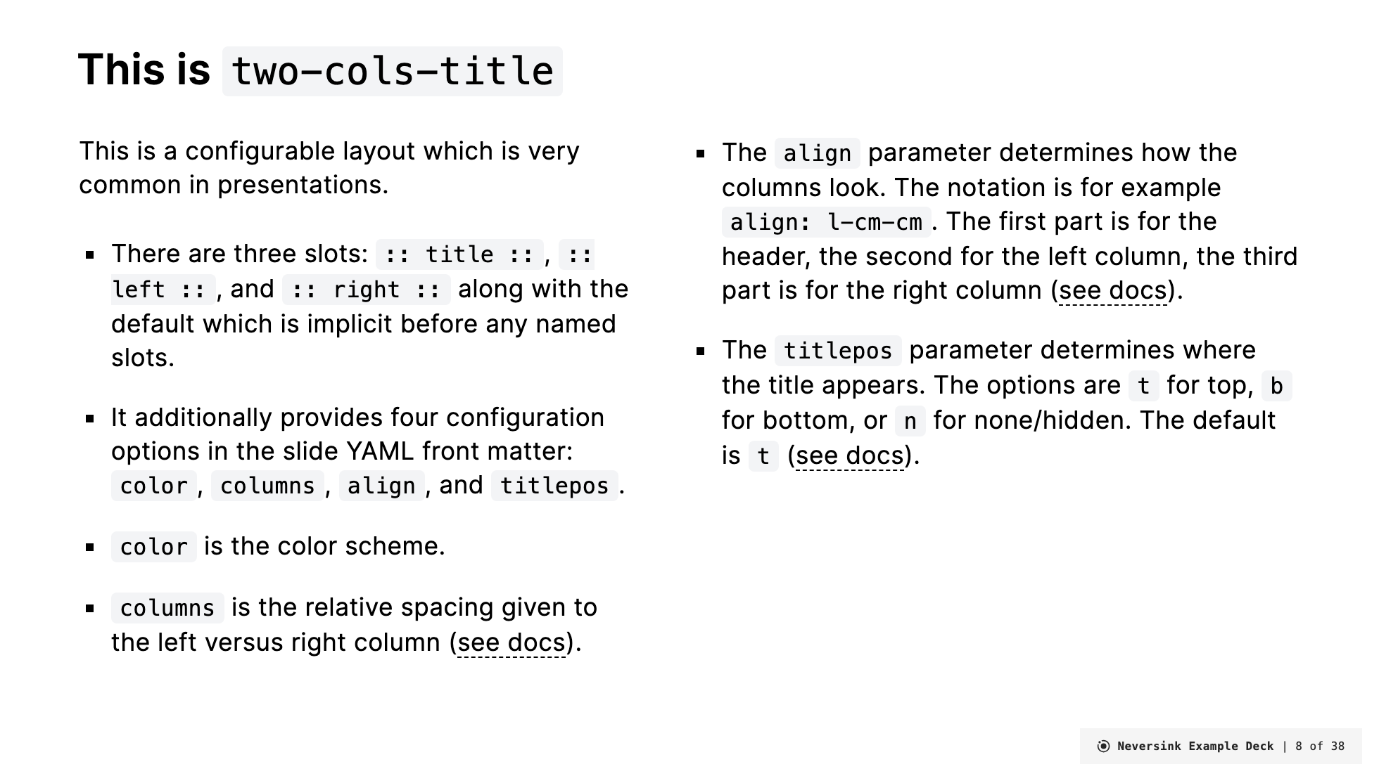
All layouts have one "default" slot (named default, but it doesn't have to be labeled). Some layouts have additional slots that you can use to customize the slide. The documentation of which slots are used in each layout is detailed below.
An example of a slide with several slots might look like this.
---
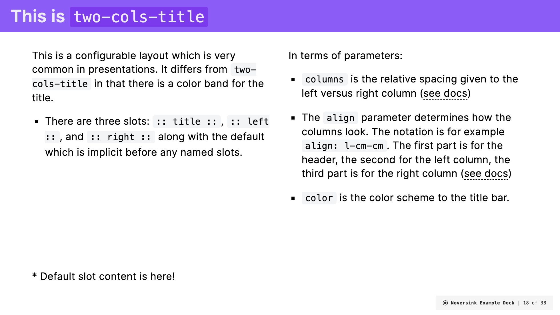
layout: two-cols-title
columns: is-6
align: l-lt-lt
title: Two Cols Title
---

This is in the default slot

:: title ::

# My slide title

:: left ::

This is the left column slot!

:: right ::

This is the right column slot!
Here, we are using the two-cols-title layout, which has three named slots: title, left, and right in addition to the default slot given to every slide. In this example, the title slot is used to specify the title of the slide, and the left and right slots are used to specify the content of the left and right columns, respectively. Slot definitions end when the next one begins, so the title slot ends when the left slot begins. Any Markdown content that appears before the first named slot is assigned to the default slot. If there are no named slots, all content is assigned to the default slot.
Specific Layouts
In the following section, we detail specific layouts that are available in this theme. Each layout is described in terms of its frontmatter, slots, and examples of how to use it.
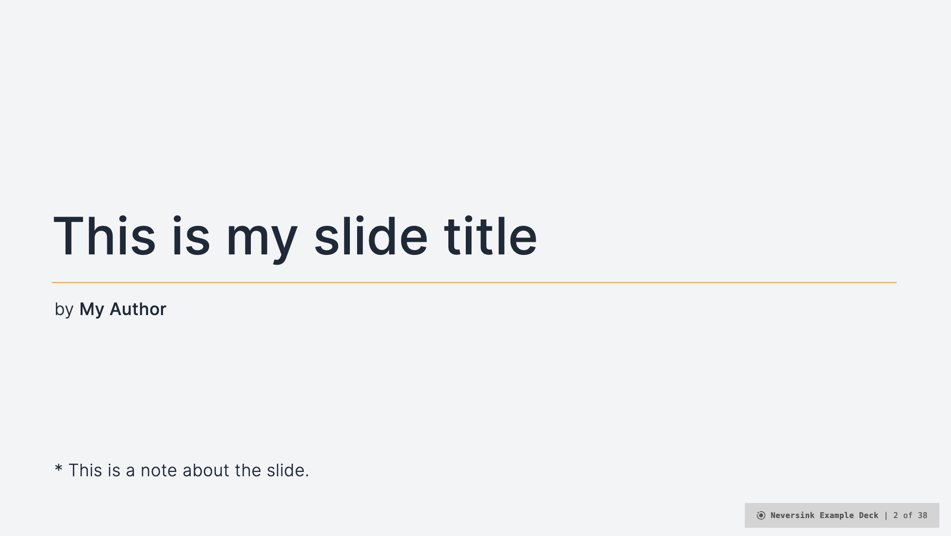
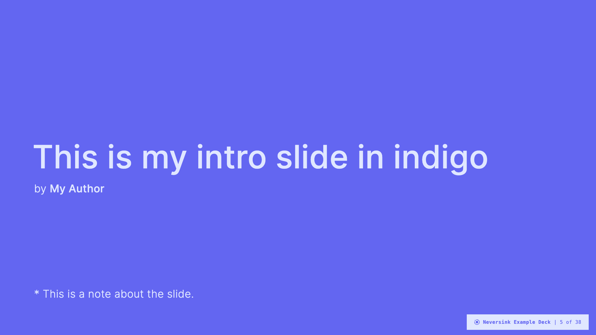
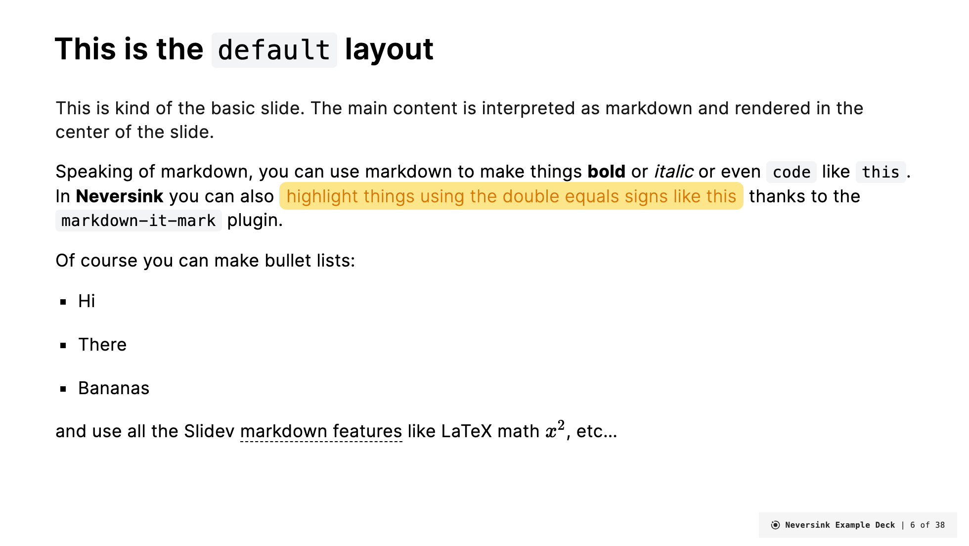
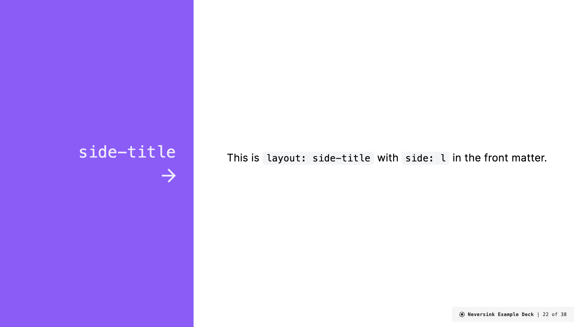
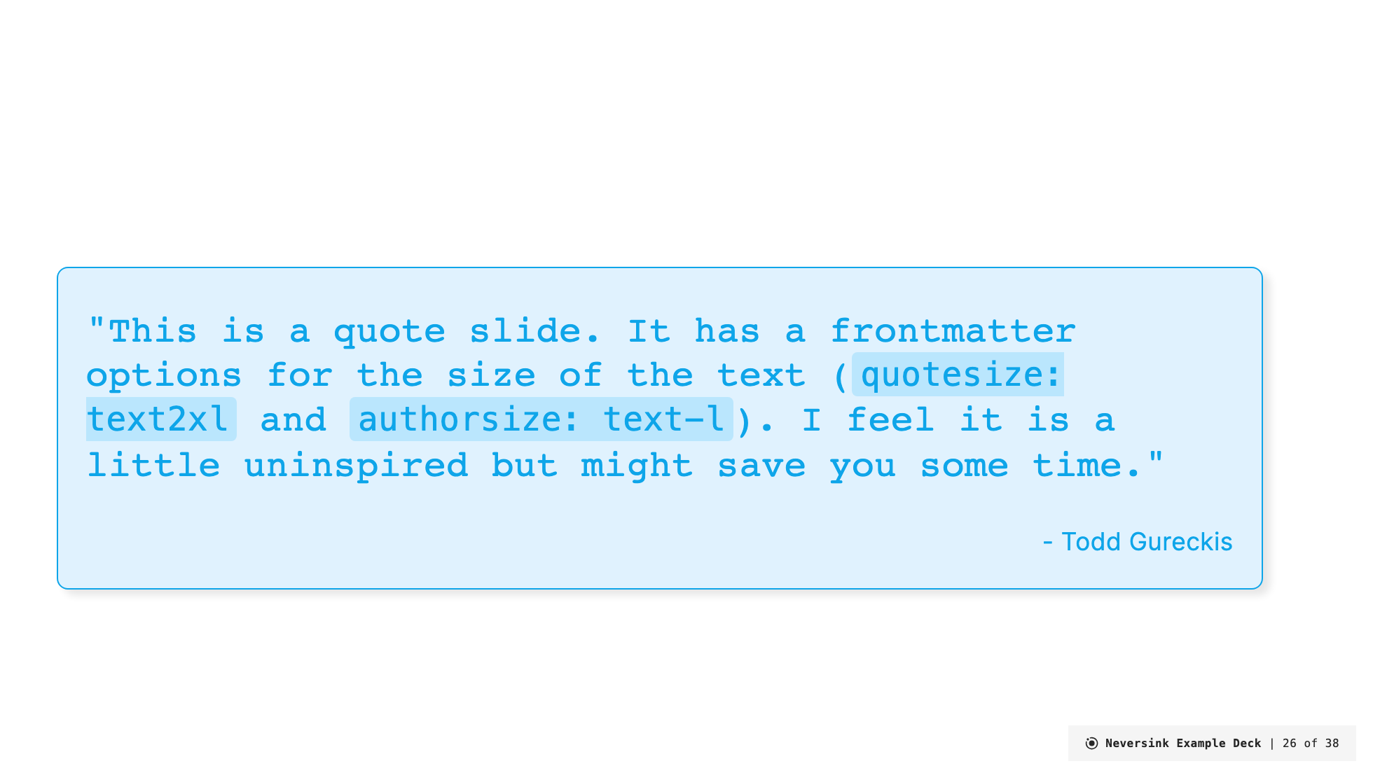
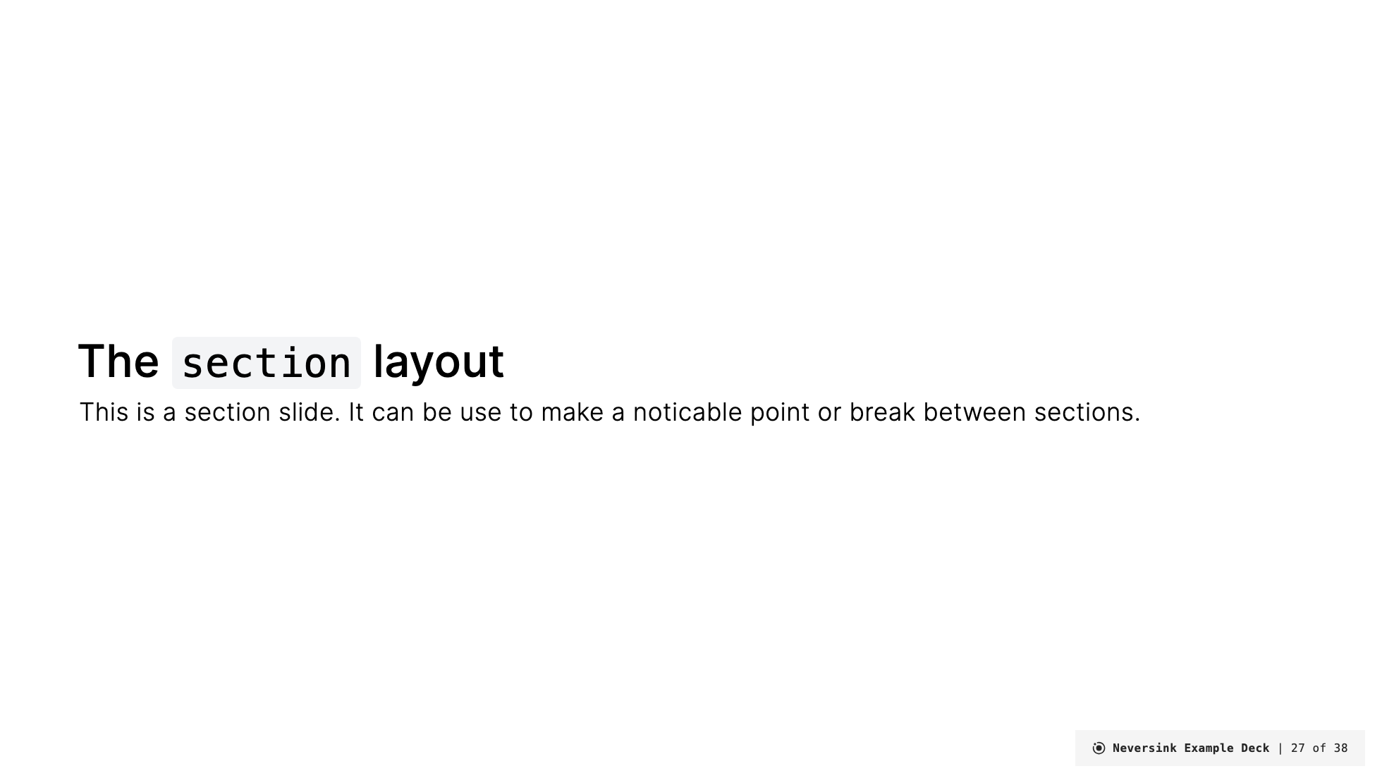
layout: coverlayout: introlayout: defaultlayout: two-cols-titlelayout: top-titlelayout: top-title-two-colslayout: side-titlelayout: quotelayout: sectionlayout: fulllayout: credits
In addition to these custom layouts, you can still access default Slidev layouts. For example, in cases where the layout name is not mentioned you can access the basic versions described here.
For example,
layout: image-leftlayout: image-rightlayout: imagelayout: iframe-leftlayout: iframe-rightlayout: iframelayout: nonelayout: endlayout: fact
All act in the same ways as the default Slidev theme currently. One limitation is that these layouts cannot be customized by the Neversink color schemes. In future will make themed versions of these.
