layout: side-title
Description
With layout: side-title the title is anchored to the left or right side of the slide. This can add a more dramatic burst of color since more of the slide's visible area is devoted to the title color block. Because the spacing and alignment of columns often needs to be adjusted on a case-by-case basis, this layout provides a lot of flexibility by creating a simple design system you can use to fine-tune the two column/title arrangement.
In the conception of this design system, the entire slide is divided into 12 equally spaced units. Frontmatter determines how many of those 12 units are allocated to the title versus the content.

For example, if titlewidth: is-6 is specified in the frontmatter, the title will be allocated 6 units and the main content will be allocated 6 units like this:

If titlewidth: is-3 is specified, the title will be allocated 3 units and the content will be allocated 9 units like this:

You can bump the width of the columns quickly to fit your content.
The alignment of the content in each column is also configurable. Content can be vertically aligned to the top, middle, or bottom of the slide. In addition the content can be horizontally aligned to the left, center, or right aligned within the column:

You can also configure if the title block is attached to the left or right side of the slide:

A default slot is provided for content that appears before a named slot. This content will appear at the bottom of the content column.
Frontmatter
layout: side-title(required).color:(optional) can be any of the color scheme options. If not provided, the default color islight.titlewidth:(optional) gives the width of the title. The default value isis-one-third. As described above, the slide is divided into 12 column units. Withtitlewidth: is-3the title column is 3/12 wide and the the content column is 9/12 wide. Here is a full list of the available shorthands:
| Title:Content Size | Frontmatter short names |
|---|---|
| 1:11 | is-1is-1-11is-one-twelfth |
| 2:10 | is-2is-2-10is-one-sixth |
| 3:9 | is-3is-3-9is-one-quarter |
| 4:8 | is-4is-4-8is-one-third |
| 5:7 | is-5is-5-7 |
| 6:6 | is-6is-6-6is-two-quartersis-two-fourthsis-one-halfis-half |
| 7:5 | is-7is-7-5 |
| 8:4 | is-8is-8-4is-two-thirds |
| 9:3 | is-9is-9-3is-three-quartersthree-fourths |
| 10:2 | is-10is-10-2 |
| 11:1 | is-11is-11-1 |
align:(optional) determines the alignment of the content in different parts of the slides. The options are usually specified in two parts using kebab notation. The first segment applies to the left side, the second to the right side. The first letter of each segment is eitherlfor left,cfor center, orrfor right. This sets the text alignment of that section. The second letter of the left and right segments are eithertfor top,mfor middle, orbfor bottom. This sets the vertical alignment of the content in that column. Notice means the alignment applies to columns not to the title/content. So if thealign: lm-rtthen the title column will belm. But ifside: rthen the title will be on the right side of the slide andrtwill apply to the title. To simplify this, the default value isautowhich adopts therm-ltalignment when theside: land thelt-lmalignment when theside: r.side:(optional) is eitherl(left attached) orr(right attached). This determines the position of the title. The default value isl.
Example:
---
layout: side-title
align: l
color: light
---
Slots
This side-title slide has two named slots which are all optional: :: title ::, and :: content ::. In addition, the :: default :: slot exits for any content that appears before a named slot. It will appear at the bottom of the content side of the slide. If the title is not provided the color space for it will still appear. If content is not provided the default slot will reclaim the space.
A common use case for the default slot is to include things like StickyNotes in this default section and then use Slidev's v-drag directive to move them into position on the slide. An example below make use of this technique.
Examples
Basic example
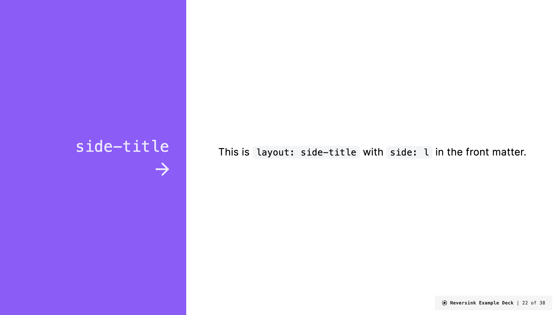
---
layout: side-title
side: l
color: violet
titlewidth: is-4
align: rm-lm
title: Side Title Layout (Another)
---

:: title ::

# `side-title`

# <mdi-arrow-right />

:: content ::

This is `layout: side-title` with `side: l` in the front matter.
Renders as:
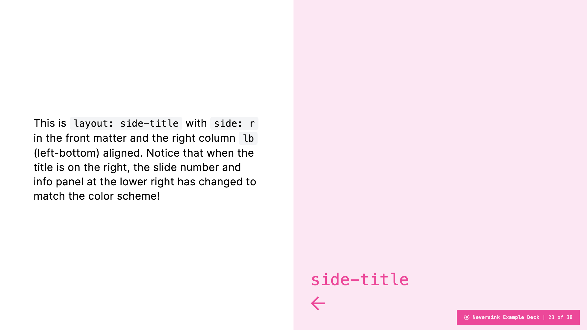
Anchor title to the right
---
layout: side-title
side: r
color: pink-light
titlewidth: is-6
align: lm-lb
title: Side Title Layout (Another)
---

:: title ::

# `side-title`

# <mdi-arrow-left />

:: content ::

This is `layout: side-title` with `side: r` in the front matter
and the right column `lb` (left-bottom) aligned.
Renders as:
Putting things on opposite corners
---
layout: side-title
side: l
color: amber-light
titlewidth: is-6
align: lt-lb
---

:: title ::

# `side-title`

# <mdi-arrow-right />

:: content ::

This is `layout: side-title` with `side: l` in the front matter
and the left column `lt` (left-top) and the right column `lb` (left-bottom) aligned.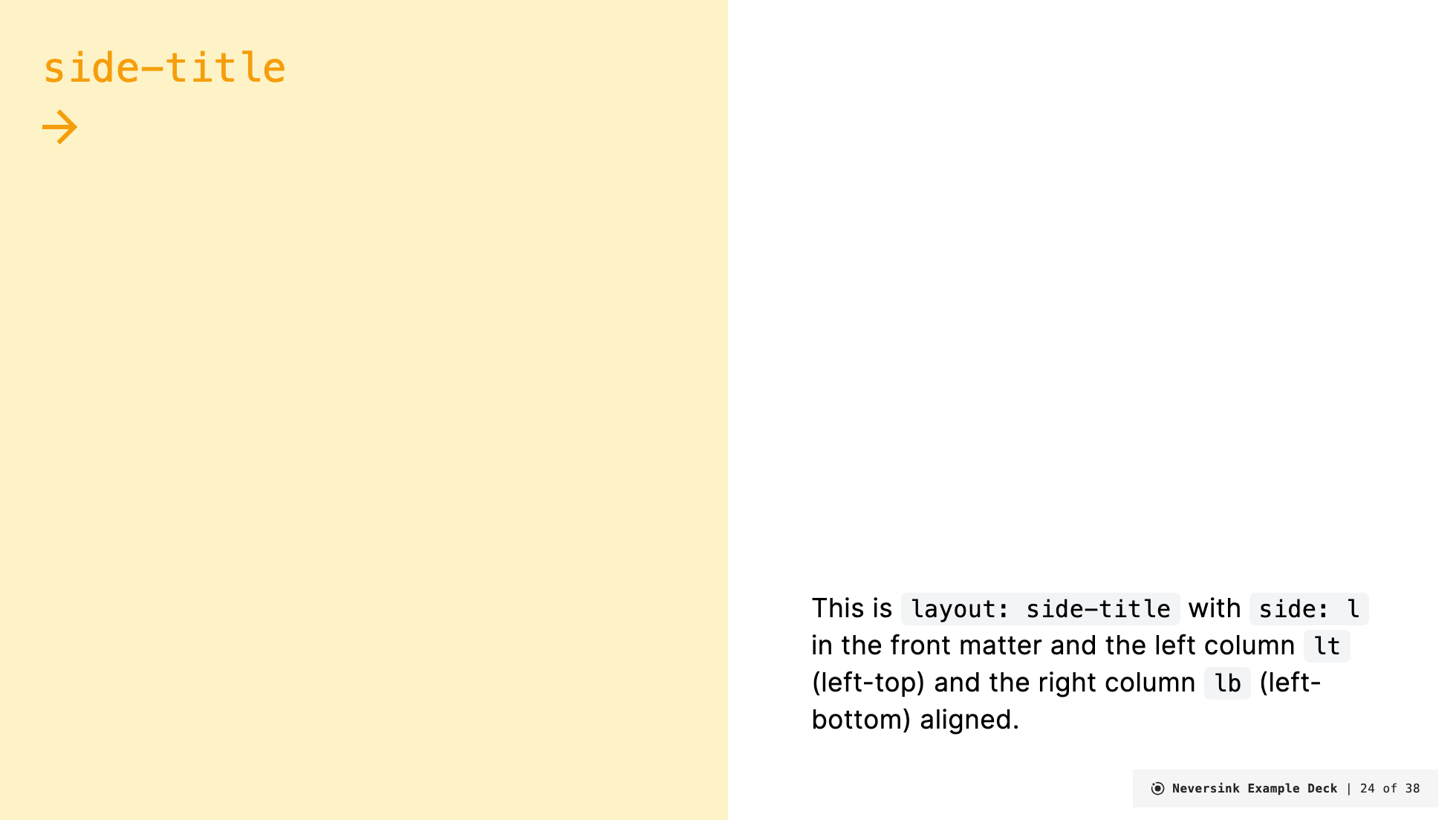
No title at all
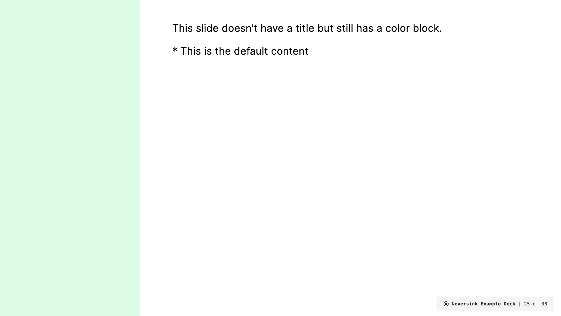
---
layout: side-title
side: l
color: green-light
titlewidth: is-3
align: auto
---

\* This is the default content

:: content ::

This slide doesn't have a title but still has a color block.