Styling
In addition to layouts and components, Neversink also provides some helpful CSS classes to help with common slide formatting tasks.
These are included in styles/neversink.css. Each class in this file begins with ns-c- to indicate that it is a Neversink class.
Colors
In addition to the main color schemes there are some additional short hand classes you can use in your slides content.
| Alias | Equivalent |
|---|---|
ns-c-bk-scheme | neversink-black-scheme |
ns-c-wh-scheme | neversink-white-scheme |
ns-c-dk-scheme | neversink-dark-scheme |
ns-c-lt-scheme | neversink-light-scheme |
ns-c-nv-scheme | neversink-navy-scheme |
ns-c-nv-lt-scheme | neversink-navy-light-scheme |
ns-c-COLOR-scheme | neversink-COLOR-scheme |
ns-c-COLOR-lt-scheme | neversink-COLOR-light-scheme |
where color is the first two letters of the colors in the project (e.g., ns-c-pi-scheme for neversink-pink-scheme).
Color bind
When you want to apply a theme color to an element on a page you can use the ns-c-bind-scheme class. This will apply the color to the text and the background.
It has a definition like this:
.ns-c-bind-scheme {
  background-color: var(--neversink-bg-color);
  color: var(--neversink-text-color);
  border-color: var(--neversink-border-color);
}
so to bind the color to a div element you can do this:
<div class="ns-c-bind-scheme ns-c-sk-scheme">
  This is a with the `ns-c-sk-scheme` (i.e., `neversink-sky-scheme`) color applied.
</div>
Tight bullets
If you want to make bullets a little closer together to make spaceadd the class='ns-c-tight'
<div class="ns-c-tight">

- Hi
- There
- I need space
</div>
Other options are ns-c-verytight and ns-c-supertight.
Slide Margins
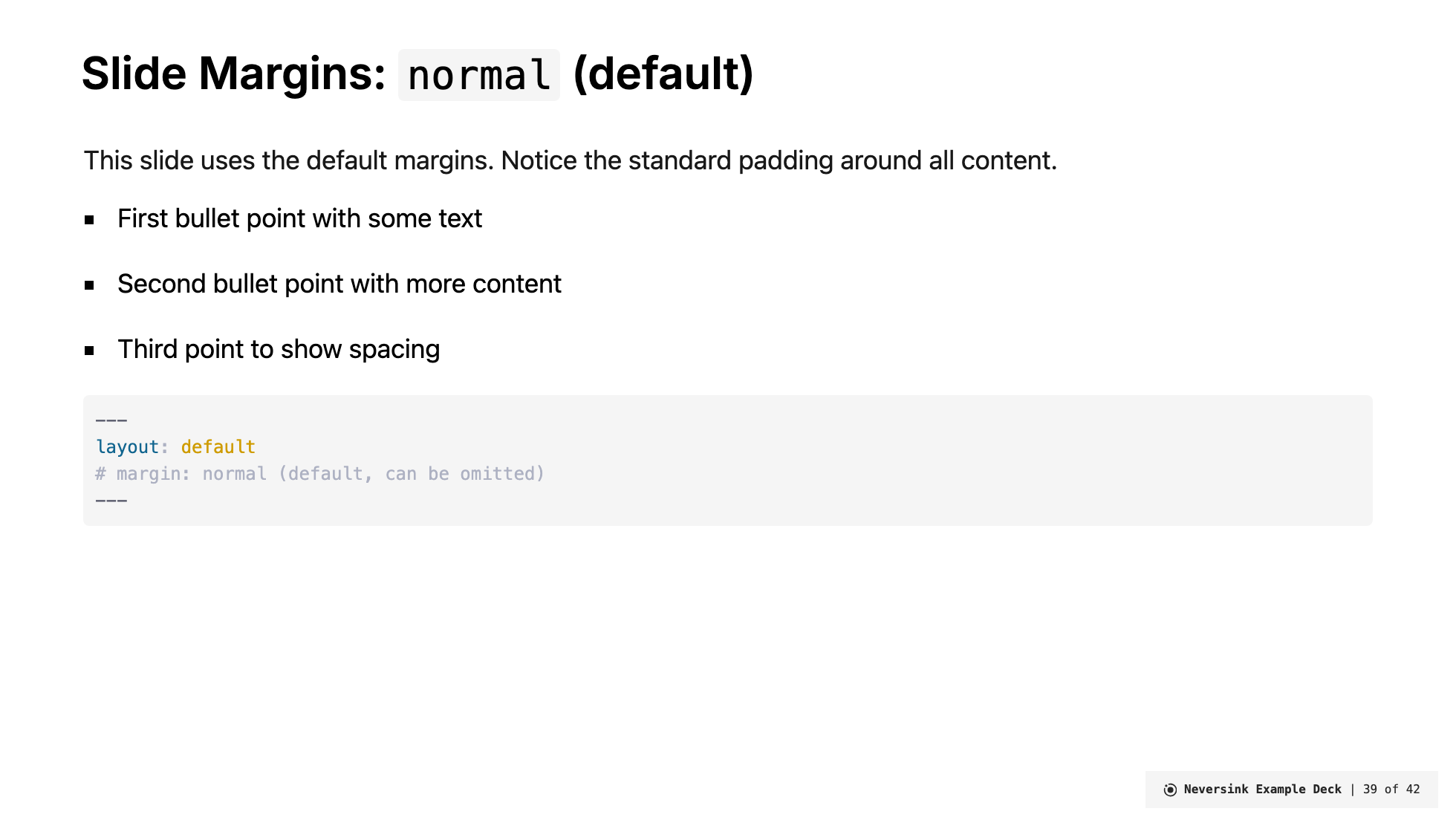
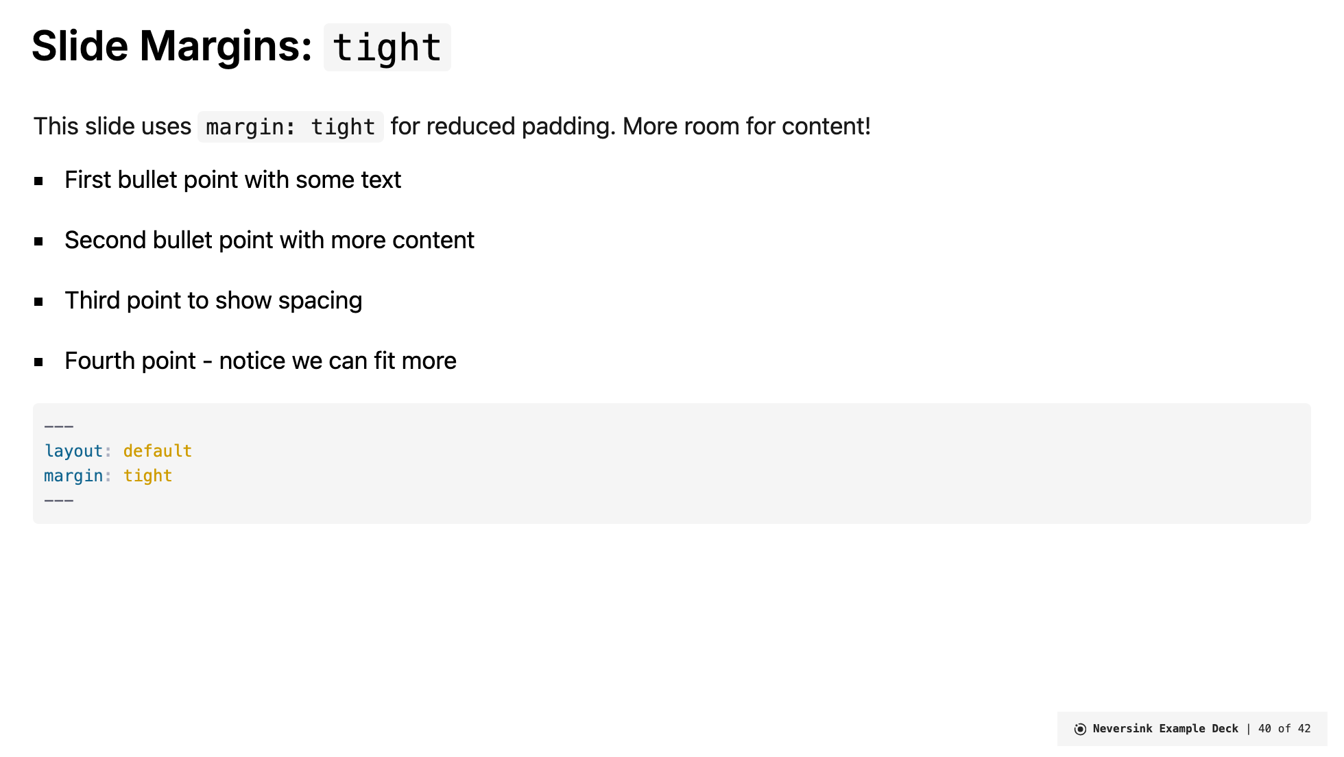
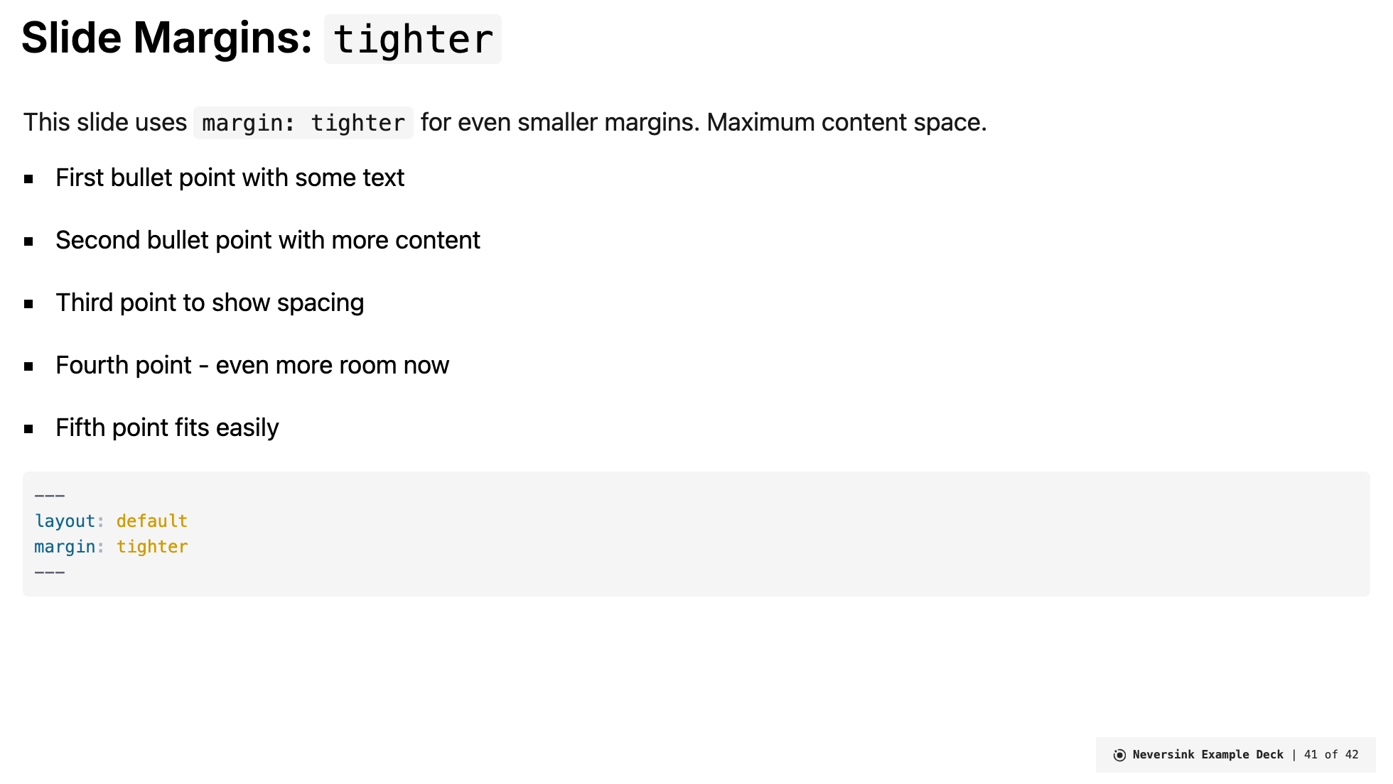
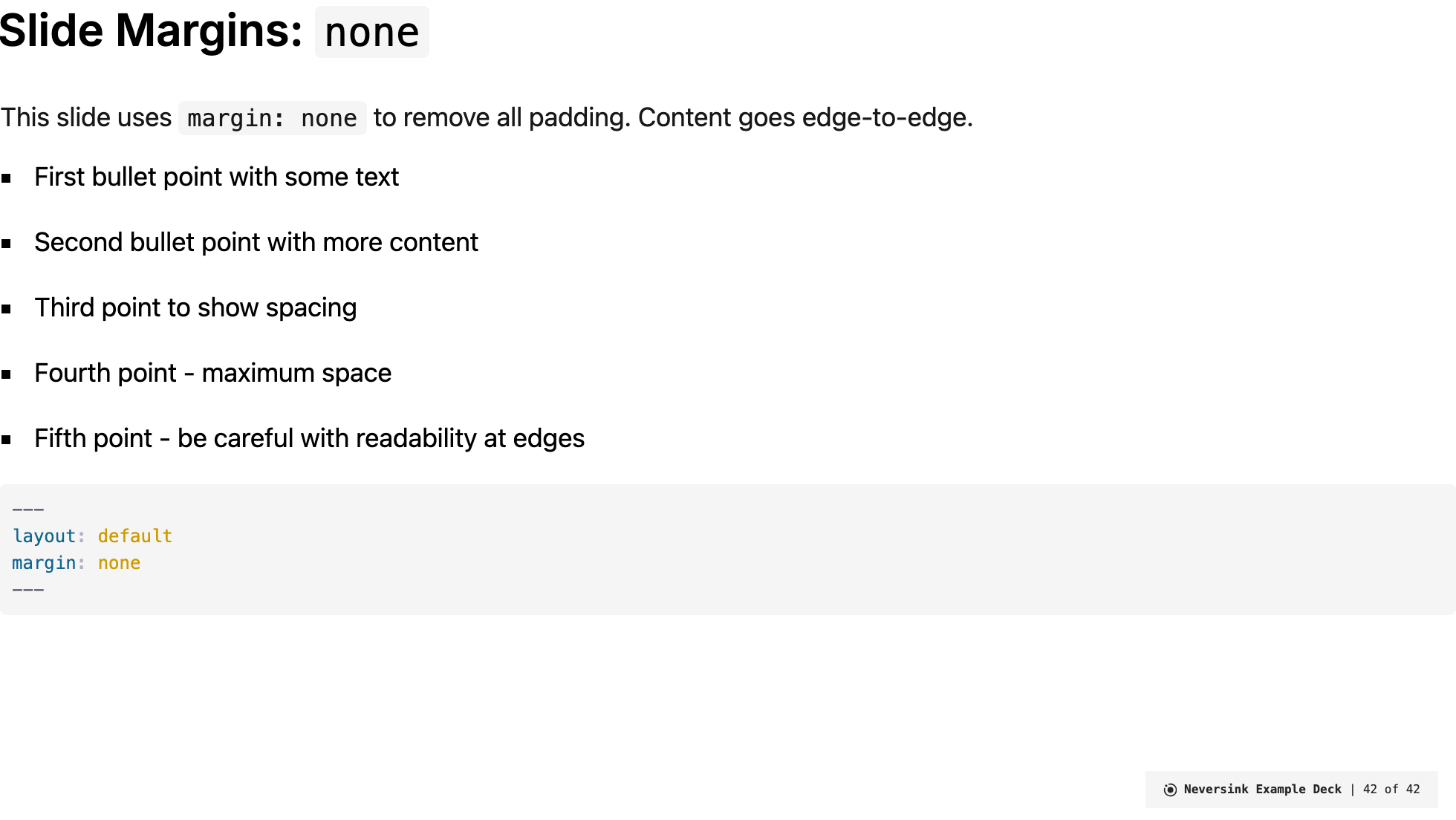
Sometimes you need more space on a slide to fit extra content. Neversink provides two ways to reduce slide margins:
Frontmatter Option
Most layouts support a margin frontmatter option:
---
layout: default
margin: tight
---| Value | Description | Top Padding | Side Padding |
|---|---|---|---|
normal | Default margins (no change) | 1.8rem | default |
tight | Reduced padding for more content space | 0.8rem | 1.5rem |
tighter | Even smaller margins | 0.4rem | 1rem |
none | Remove all padding | 0 | 0 |
This works with layouts: default, full, section, top-title, top-title-two-cols, side-title, and two-cols-title.
Visual Comparison
Here's how each margin setting affects slide content:
margin: normal (default)
margin: tight
margin: tighter
margin: none
CSS Classes
You can also apply margin classes directly to elements:
| Class | Effect |
|---|---|
ns-c-tight-margin | Reduced padding (same as margin: tight) |
ns-c-tighter-margin | Even smaller margins (same as margin: tighter) |
ns-c-no-margin | Remove all padding (same as margin: none) |
Example using a class on a div:
<div class="ns-c-tight-margin">
  Content with reduced margins
</div>
When to Use Each Option
normal: Most slides - good balance of whitespace and contenttight: When you need a little extra room for one more bullet point or a slightly larger imagetighter: For data-heavy slides, large tables, or detailed diagramsnone: Full-bleed images, custom layouts, or when you need absolute control over positioning
Centering content
If you have a div and want to to appear in the center of enclosing element:
<div class="ns-c-center-item">
  This is centered
</div>
This sets the margin-left and margin-right to auto and the width to fit-content.
v-clicks faders
If you want to fade out a bullet as you step through, add the class='ns-c-fader'
<v-clicks at="+0" class="ns-c-fader">

- This one appears immediately on slide load
- This is a second click
- This is a third click

</v-clicks>
References
Including references often you want to include them but have them fade a bit relative to the main content of the tslide for this ns-c-cite is useful as it applies a smaller, italic, and gray color to the text.
.ns-c-cite {
  font-size: 0.75em;
  font-style: italic;
  @apply text-gray-400;
}
To position the cittion on the bottom left of the slide add ns-c-cite-bl for bottom-left.
.ns-c-cite-bl {
  text-align: left;
  margin-bottom: 0.85em;
  margin-left: 1.5em;
  margin-top: auto;
}
Quote
For quotes that appear outside the context of a quote layout you can use ns-c-quote to apply a larger font size and italic style.
.ns-c-quote {
  font-family: var(--neversink-quote-font);
  font-weight: 300;
  @apply leading-relaxed;
}
Icon links
If you write an icon in a link it includes the underline styleing. To remove that use ns-c-iconlink.
/* for links that are icons.  removes underlining which is default for links in markdown parser */
.ns-c-iconlink a {
  border-style: none !important;
  border-bottom: none !important;
}
Aliases include ns-c-plainlink and ns-c-nounderline.
Grids
This is not a specific ns-c- class but a general unocss/tailwind utility for making grids.
<div class="grid grid-cols-2 gap-4  w-full">
  <div class="grid-item grid-span-1 center">Row 1, Col 1</div>
  <div class="grid-item grid-span-1 center">Row 1, Col 2</div>
  <div class="grid-item grid-span-1 center">Row 2, Col 1</div>
  <div class="grid-item grid-span-1 center">Row 2, Col 2</div>
</div>
For putting images in grids
If you want to put images in a grid and have them fill the space you can use the ns-c-imgtile class.
.ns-c-imgtile img {
  width: 100%;
  height: fit-content;
  object-fit: cover;
}
then you use it like this:
<div class="grid grid-cols-2 gap-4  w-full">
  <div class="grid-item grid-span-1 center"><img src="/images/img1.jpg" /></div>
  <div class="grid-item grid-span-1 center"><img src="/images/img2.jpg" /></div>
  <div class="grid-item grid-span-1 center"><img src="/images/img3.jpg" /></div>
  <div class="grid-item grid-span-1 center"><img src="/images/img4.jpg" /></div>
</div>
Columns
To make side by side columns use a flex box with flex-wrap and w-1/X where X is the proportion you want to give to each column.
<div class="flex flex-wrap ">
  <div class="w-1/5">Hit wall</div>
  <div class="w-1/5">Hit wall and goes on floor</div>
  <div class="w-1/5">Hit wall and goes in bucket</div>
  <div class="w-1/5">Misses wall</div>
  <div class="w-1/5">Hit bucket and then hits walls</div>
</div>
To add a border
<div class="flex flex-wrap ">
  <div class="w-1/5 border-1 border-r-0">Hit wall</div>
  <div class="w-1/5 border-1 border-r-0">Hit wall and goes on floor</div>
  <div class="w-1/5 border-1 border-r-0">Hit wall and goes in bucket</div>
  <div class="w-1/5 border-1 border-r-0">Misses wall</div>
  <div class="w-1/5 border-1">Hit bucket and then hits walls</div>
</div>
Borders
I forgot why i made this utility
.ns-c-border {
  border-left: 0.25em solid var(--neversink-text-color);
  background-color: var(--neversink-bg-color);
  color: var(--neversink-text-color);
  margin-top: 0.5em;
  margin-bottom: 0.5em;
  padding-left: 1em;
  padding-right: 1em;
}