StickyNote
Description
StickyNotes are a take on the classic computer metaphor of a sticknote. They are often used to provide notes or additional information to the viewer.
StickyNote
The StickyNote component is used to create a colored box with an title and content. The StickyNote component has the following props:
title(optional). Default value is ''color(optional) can be any of the color scheme options. If not provided, the default color isamber-light.width(optional) the width of the admonition. Default is180px.textAlign(optional) the text alignment of the content. Default isleft.custom(optional) a custom CSS class to apply to the sticky note content. Default is empty.customTitle(optional) a custom CSS class to apply to the sticky note title. Default isblock text-xs font-mono tracking-normal font-bold.devOnly(optional) when set totrue, the sticky note will only be visible in development mode and will be hidden in production builds and exports. This is useful for personal notes or reminders that shouldn't appear in the final presentation. Default isfalse.
Example:
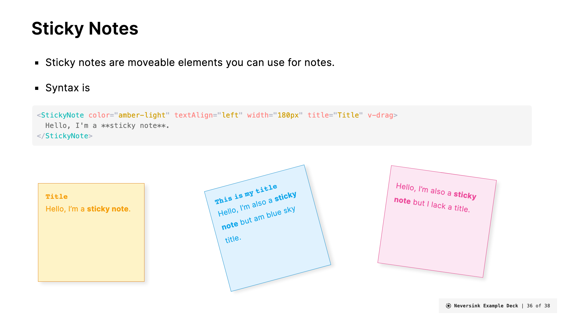
<StickyNote color="amber-light" textAlign="left" width="180px" title="Title">
  Hello, I'm a **sticky note**.
</StickyNote>
Renders as:
Hello, I'm a sticky note.
You can also add custom CSS classes to style the sticky note content and title:
<StickyNote
  color="teal-light"
  width="200px"
  title="Custom Styled"
  custom="text-lg font-bold text-center"
  customTitle="text-red-500 text-lg"
>
  This content has custom styling applied.
</StickyNote>
Renders as:
If you want to position it somewhere arbitrary on the slide add v-drag to the admonition and also set the width to something fixed (e.g., 300px):
<StickyNote color="amber-light" textAlign="left" width="180px" title="Title" v-drag>

Hello, I'm a **sticky note**.
</StickyNote>
Another color:
<StickyNote color="pink-light" textAlign="left" width="180px" title="Title">
  Hello, I'm a **sticky note**.
</StickyNote>Hello, I'm a sticky note.
Dev-Only Notes
Use the devOnly prop to create sticky notes that only appear during development. These are perfect for speaker notes, reminders, or TODOs that you don't want in your exported presentation:
<StickyNote color="amber-light" width="180px" title="Note to self" devOnly>
  Remember to add more examples here before the talk!
</StickyNote>
When devOnly is set to true:
- The sticky note is visible when running
slidev dev - The sticky note is hidden when running
slidev buildorslidev export