layout: two-cols-title
Description
The layout: two-cols-title layout is among the most common layouts in talks. It has an optional title along the top or bottom of the slide, and then the main section is divided into two columns. Because the spacing and alignment of columns often needs to be adjusted on a case-by-case basis, this layout provides a lot of flexibility by creating a simple design system you can use to fine-tune the two column/title arrangement.
In the conception of this design system, the two columns of the main content of the slide share 12 equally spaced units. Frontmatter determines how many of those 12 units are allocated to each column. 
For example, if columns: is-6 is specified in the frontmatter, the left column will be allocated 6 units and the right column will be allocated 6 units like this:

If columns: is-4 is specified, the left column will be allocated 4 units and the right column will be allocated 8 units like this:

You can bump the width of the columns quickly to fit your content.
The alignment of the content in each column is also configurable. Content can be vertically aligned to the top, middle, or bottom of the slide. In addition the content can be horizontally aligned to the left, center, or right aligned within the column:

The title which can only be left, center, or right aligned because it occupies a narrow band on the slide.
The position of the title on the slide can also be configured. It can be at the top or bottom of the slide, or hidden/missing entirely. The default position is at the top:

A default slot is provided for content that appears before a named slot. This content will appear at the bottom of the slide.
Frontmatter
layout: two-cols-header(required).color:(optional) can be any of the color scheme options. If not provided, the default color iswhite.columns:(optional) gives the width to the left and right column. The default value isis-one-half. As described above, the slide is divided into 12 column units. Withcolumns: is-1-11the left column is 1/12 wide and the the right columns is 11/12 wide. The component admits a short hand of only specifying the left column (columns: is-1does the same thing). Here is a full list of the available shorthands:
| Left:Right Column Size | Frontmatter short names |
|---|---|
| 1:11 | is-1is-1-11is-one-twelfth |
| 2:10 | is-2is-2-10is-one-sixth |
| 3:9 | is-3is-3-9is-one-quarter |
| 4:8 | is-4is-4-8is-one-third |
| 5:7 | is-5is-5-7 |
| 6:6 | is-6is-6-6is-two-quartersis-two-fourthsis-one-halfis-half |
| 7:5 | is-7is-7-5 |
| 8:4 | is-8is-8-4is-two-thirds |
| 9:3 | is-9is-9-3is-three-quartersthree-fourths |
| 10:2 | is-10is-10-2 |
| 11:1 | is-11is-11-1 |
align:(optional) determines the alignment of the content in different parts of the slides. The options are specified in three parts using kebab notation. The first segment applies to the title, the second to the left column, and the third to the right column. i.e.,title-left-right. The first letter of each segment is eitherlfor left,cfor center, orrfor right. This sets the text alignment of that section. The second letter of the left and right segments are eithertfor top,mfor middle, orbfor bottom. This sets the vertical alignment of the content in that column. The title segment only can configure thel/c/ralignment since it only occupies a narrow band at the top of the slide. The default value isl-lt-ltwhich aligns the content in the title to left margin, the content of the left column to the left, the content in the left column to the top, and the content in the right column to the top.titlepos:(optional) is eithert(top),b(bottom), orn(none). This determines the position of the title. The default value ist.
Example:
---
layout: two-cols-header
columns: is-4
align: c-rm-lt
color: light
titlepos: t
---
Slots
This two-cols-title slide has three name slots which are all optional: :: title ::, :: left ::, and :: right ::. In addition, the :: default :: slot exits for any content that appears before a named slot. It will appear at the bottom of the slide. If the title is not provided the space will be reallocated the columns. If the left or right is not provided the space for them will remain according to columns: frontmatter.
A common use case for the default slot is to include things like StickyNotes in this default section and then use Slidev's v-drag directive to move them into position on the slide. An example below make use of this technique.
Examples
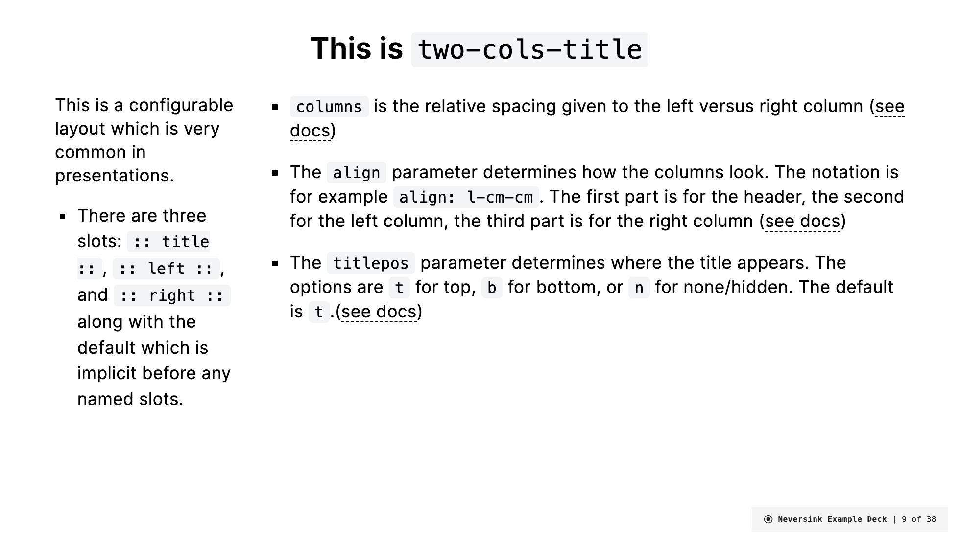
Basic example
---
layout: two-cols-title
columns: is-6
align: l-lt-lt
---

:: title ::

# This is `two-cols-title`

:: left ::

This is a configurable layout which is very common in presentations.

- There are three slots: `:: title ::`, `:: left ::`, and `:: right ::` along with the default which is implicit before any named slots.

- It additionally provides four configuration options in the slide YAML front matter:
  `color`, `columns`, `align`, and `titlepos`.

- `color` is the color scheme.

- `columns` is the relative spacing given to the left versus right column ([see docs](https://gureckis.github.io/slidev-theme-neversink/layouts/two-cols-title)).

:: right ::

- The <code>align</code> parameter determines how the columns look. The notation is for example <code>align: l-cm-cm</code>. The first part is for the header, the second for the left column, the third part is for the right column ([see docs](https://gureckis.github.io/slidev-theme-neversink/layouts/two-cols-title)).

- The <code>titlepos</code> parameter determines where the title appears. The options are `t` for top, `b` for bottom, or `n` for none/hidden. The default is `t` ([see docs](https://gureckis.github.io/slidev-theme-neversink/layouts/two-cols-title)).
Renders as:
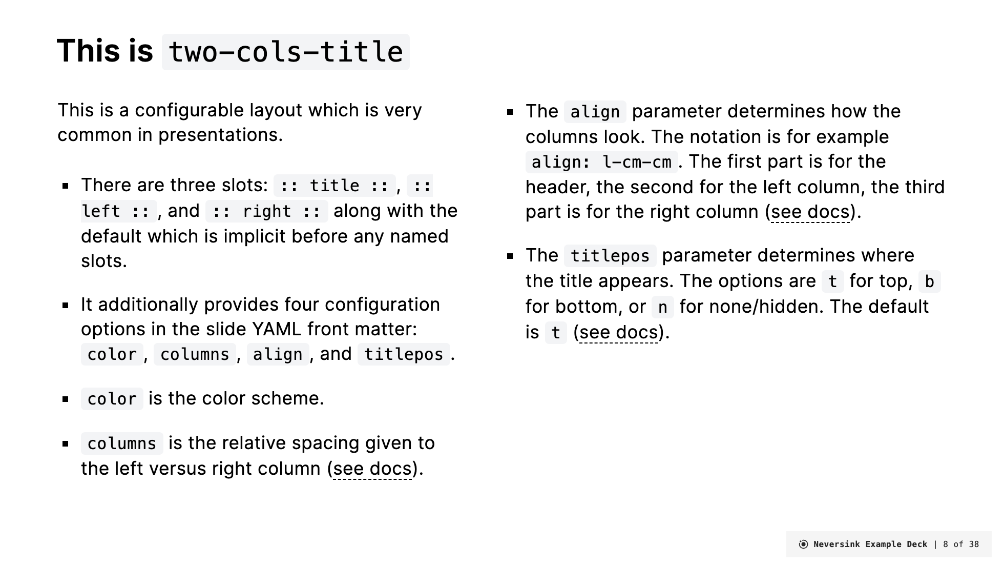
Less content on the left now so lets rebalance things
---
layout: two-cols-title
columns: is-3
align: c-lt-lt
---

:: title ::

# This is `two-cols-title`

:: left ::

This is a configurable layout which is very common in presentations.

- There are three slots: `:: title ::`, `:: left ::`, and `:: right ::` along with the default which is implicit before any named slots.

:: right ::

- `columns` is the relative spacing given to the left versus right column ([see docs](https://gureckis.github.io/slidev-theme-neversink/layouts/two-cols-title))

- The <code>align</code> parameter determines how the columns look. The notation is for example
  <code>align: l-cm-cm</code>. The first part is for the header, the second for the left column, the third part is for the right column ([see docs](https://gureckis.github.io/slidev-theme-neversink/layouts/two-cols-title))

- The <code>titlepos</code> parameter determines where the title appears. The options are `t` for top, `b` for bottom, or `n` for none/hidden. The default is `t`.([see docs](https://gureckis.github.io/slidev-theme-neversink/layouts/two-cols-title))
Renders as:
Really flexing the layout system now
---
layout: two-cols-title
columns: is-2
align: r-lt-lt
color: light
---

This is the default slot, if you want to use it!

:: title ::

# Another example

:: left ::
This is the left column it has been shrunk down to 2 units.

:: right ::
This gave more space to the right column.

- You can put more points
- You can make them longer
- You can place more text and images here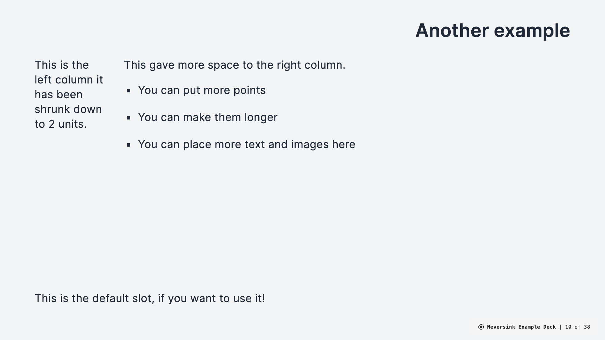
Using color and the default slot
---
layout: two-cols-title
columns: is-2
align: c-rm-lt
color: dark
---

<StickyNote color="amber-light" textAlign="left" width="180px" title="Hi" v-drag="[689,277,180,180,18]">

Hello, I'm a **sticky note**.
</StickyNote>

:: title ::

# This is `two-cols-title` with center title

:: left ::

The left column is `rm` which means right-middle.

:: right ::

The right content is left-top aligned `lt`.

The sticky note appears in the `:: default ::` slot and then used v-drag to move it into position.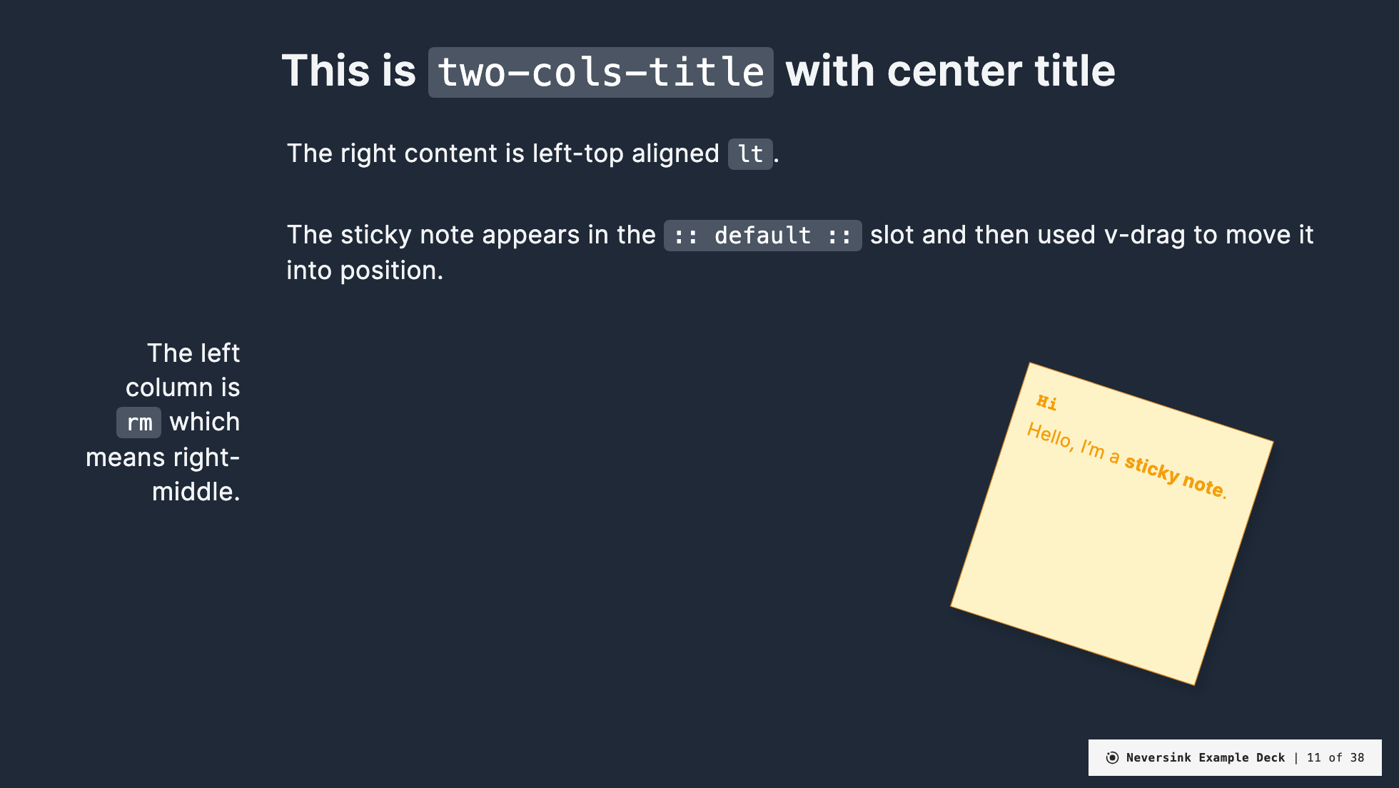
Moving the title to the bottom
---
layout: two-cols-title
columns: is-3
align: r-lt-lt
titlepos: b
---

:: title ::

# This is `two-cols-title`

:: left ::

This is a configurable layout which is very common in presentations.

- There are three slots: `:: title ::`, `:: left ::`, and `:: right ::` along with the default which is implicit before any named slots.

:: right ::

- The <code>align</code> parameter determines how the columns look. The notation is for example
  <code>align: l-cm-cm</code>. The first part is for the header, the second for the left column, the third part is for the right column ([see docs](https://gureckis.github.io/slidev-theme-neversink/layouts/two-cols-title))

- The <code>titlepos</code> parameter determines where the title appears. The options are `t` for top, `b` for bottom, or `n` for none/hidden. The default is `t`.([see docs](https://gureckis.github.io/slidev-theme-neversink/layouts/two-cols-title))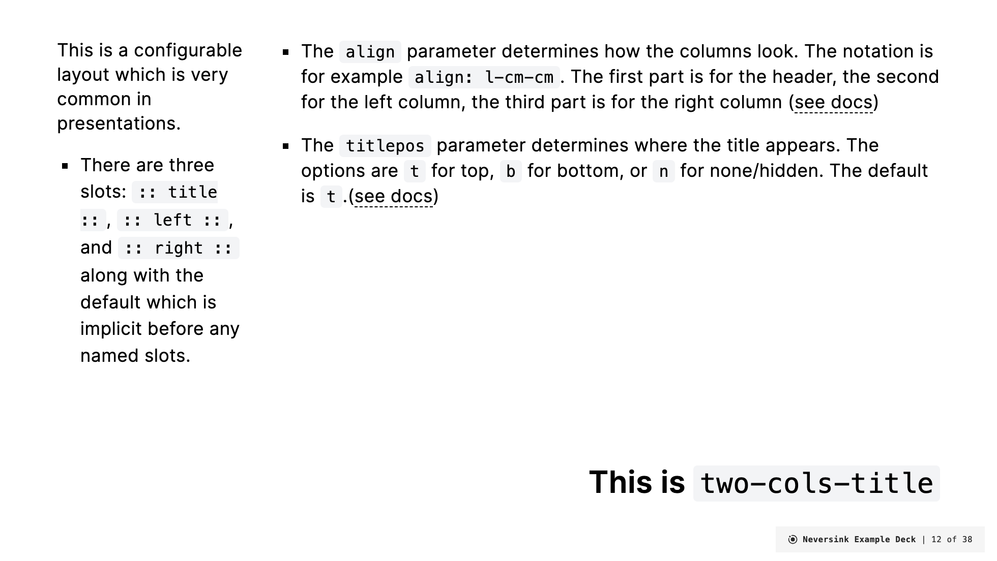
No title
---
layout: two-cols-title
columns: is-3
align: r-lt-lt
---

:: left ::

This is a configurable layout which is very common in presentations.

- There are three slots: `:: title ::`, `:: left ::`, and `:: right ::` along with the default which is implicit before any named slots.

:: right ::

- The <code>align</code> parameter determines how the columns look. The notation is for example
  <code>align: l-cm-cm</code>. The first part is for the header, the second for the left column, the third part is for the right column ([see docs](https://gureckis.github.io/slidev-theme-neversink/layouts/two-cols-title))

- The <code>titlepos</code> parameter determines where the title appears. The options are `t` for top, `b` for bottom, or `n` for none/hidden. The default is `t`.([see docs](https://gureckis.github.io/slidev-theme-neversink/layouts/two-cols-title))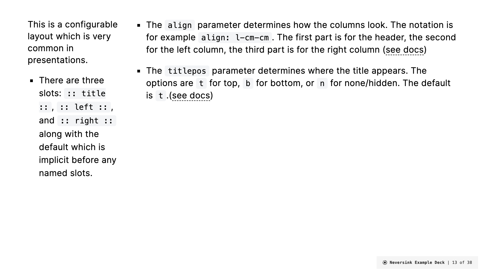
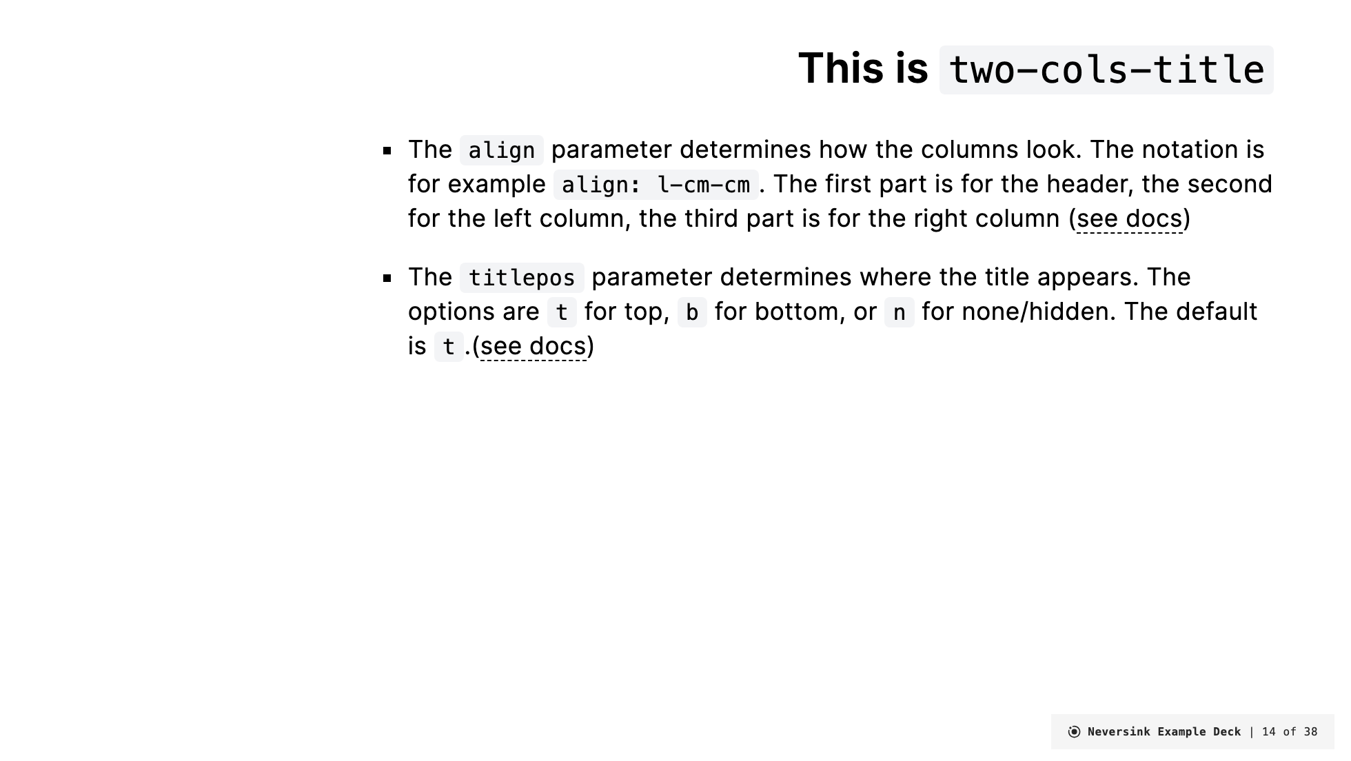
Title is back but no left column (just spaced for it)
---
layout: two-cols-title
columns: is-3
align: r-lt-lt
---

:: title ::

# This is `two-cols-title`

:: right ::

- The <code>align</code> parameter determines how the columns look. The notation is for example
  <code>align: l-cm-cm</code>. The first part is for the header, the second for the left column, the third part is for the right column ([see docs](https://gureckis.github.io/slidev-theme-neversink/layouts/two-cols-title))

- The <code>titlepos</code> parameter determines where the title appears. The options are `t` for top, `b` for bottom, or `n` for none/hidden. The default is `t`.([see docs](https://gureckis.github.io/slidev-theme-neversink/layouts/two-cols-title))