Admonitions
Description
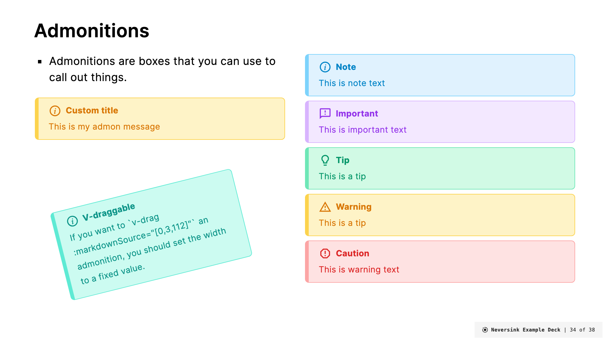
Admonitions are a way to provide additional information to the viewer. They are often used to provide warnings, notes, or tips. Admonitions are styled with a colored border and an icon to indicate the type of admonition.
There are two types of Admonitions in this theme:
Admonition
The Admonition component is used to create a colored box with an icon and a title. The admonition component has the following props:
title(optional). Default value is 'Note'color(optional) can be any of the color scheme options. If not provided, the default color isamber-light.width(optional) the width of the admonition. Default is100%.icon(optional) the icon to display. Default ismdi-information-variant-circle-outline.custom(optional) a custom CSS class to apply to the admonition content. Default is empty.customTitle(optional) a custom CSS class to apply to the admonition title. Default is empty.
Example:
<Admonition title="Info" color="teal-light" width="300px">
This is my admonition content.
</Admonition>
Renders as:
Info
This is my admonition content.
You can also add custom CSS classes to style the admonition content and title:
<Admonition title="Custom Styled" color="purple-light" custom="text-lg font-bold" customTitle="text-red-500">
This content has custom styling applied.
</Admonition>
Renders as:
Custom Styled
This content has custom styling applied.
If you want to position it somewhere arbitrary on the slide add v-drag to the admonition and also set the width to something fixed (e.g., 300px):
<Admonition title="V-draggable" color="teal-light" width="300px" v-drag>
This is my admonition content.
</Admonition>
AdmonitionType
The AdmonitionType component is used to create a colored box with an icon and a title. The admonition component has the following props:
type(optional). Default value is 'info'. Available types areinfo,important,tip,warning,caution. These choose colors and icons to match the type.width(optional) the width of the admonition. Default is100%.
Example:
<AdmonitionType type="info" width="300px">
This is my info
</AdmonitionType>
Note
This is my warning
<AdmonitionType type="important" width="300px">
This is my important
</AdmonitionType>
Important
This is my important
<AdmonitionType type="tip" width="300px">
This is my tip
</AdmonitionType>
Tip
This is my tip
<AdmonitionType type="warning" width="300px">
This is mywarning
</AdmonitionType>
Warning
This is my warning
<AdmonitionType type="caution" width="300px">
This is my caution
</AdmonitionType>
Caution
This is my caution
If you want to position it somewhere arbitrary on the slide add v-drag to the admonition and also set the width to something fixed (e.g., 300px)
<AdmonitionType type="warning" width="300px" v-drag>
This is my my warning
</Admonition>